According to the media and no doubt fuelled by press releases from the industry itself, superannuation funds are run by geniuses.We know this because they have been trumpeting the fact that they have a a not so crappy year. Note, they have not had a brilliant year where the majority of funds out performed the index rather they have not done as badly as in previous years. Think of as exploding once you hit the ground as opposed to exploding in mid air. I am always intrigued by such proclamations because I am fascinated at how the rip off that is compulsory superannuation is still perpetuated and seems to be in do danger of being disrupted. To put the recent performance of funds and their industry wide wank fest into perspective I thought I would take a look at the current figures and see if they made a difference to the long term performance of the industry. If you want the shortened version just accept that it didn’t and most funds are run by people who couldn’t run a hot bath and go make yourself a cuppa. For those who like the occasional table and chart keep reading.
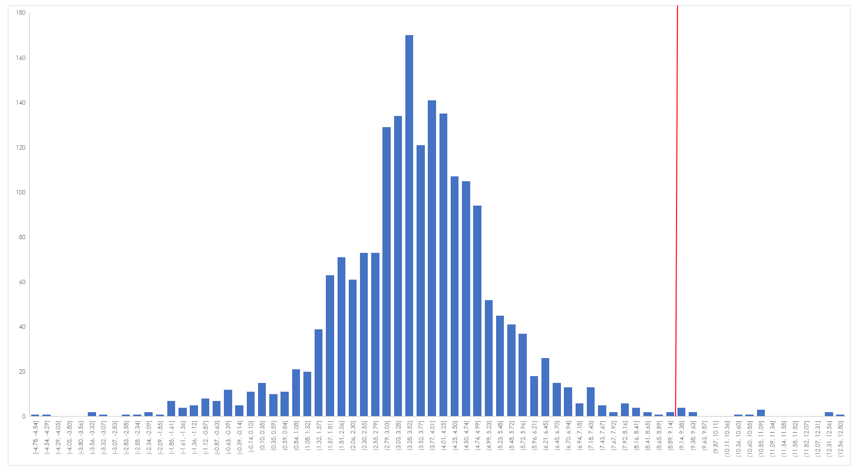
The central premise of superannuation is that it is a compulsory long term savings mechanism designed to enable retirees to self fund their retirement to a greater or lesser degree. This promotes autonomy and over the long term takes the strain off the government in providing retirement benefits. Superannuation must always be judged according to these parameters. The first step is therefore to look at the long term performance of superannuation funds against the benchmark that is the All Ordinaries Total Return Index. Unfortunately, ratings agency only quote performance for most funds out to 10 years whereas the data set for the All Ords is very deep. What I decided to do initially was to look at the simple performance of funds and drop them into a frequency histogram as shown below.
The vertical red line is the long term average performance of the index, as you can see the majority of funds based upon their 10 year average performance are well below the index. The average performance of these funds is 3.5% pa. Of the 1,264 funds that I could easily get 10 year performance data for only 8 outperformed the index over this period. That means 1,256 funds are being paid to do nothing and doing nothing costs their members a great deal of money. To get a sense of the respective returns that the various performance numbers generated I plotted the returns in a series from 1% to 13% – this being the broad range of performing funds. All this chart does is give you a sense of the both the damage done by non performance and the exacerbation of that performance courtesy of the power of compounding. Think of this chart as merely a graph of how $100,000 compounds at various rates of return. You will note that I didn’t include funds the returned 0% over the time or had a negative return.
Whilst such a chart is nominally interesting it doesn’t give a sense of the opportunity cost involved in having money in a fund compared to having money in something that replicates the index and against which all fund managers are bench marked. The following chart looks at $100,000 invested over 20 years at both the industry average rate of return and the markets long term rate of return.
As can be seen the average industry fund lags the market by a substantial margin.However, the situation is actually worse than that because this does not take into account fees. Over the life of any investment fees take a toll and they act as a drag upon performance.
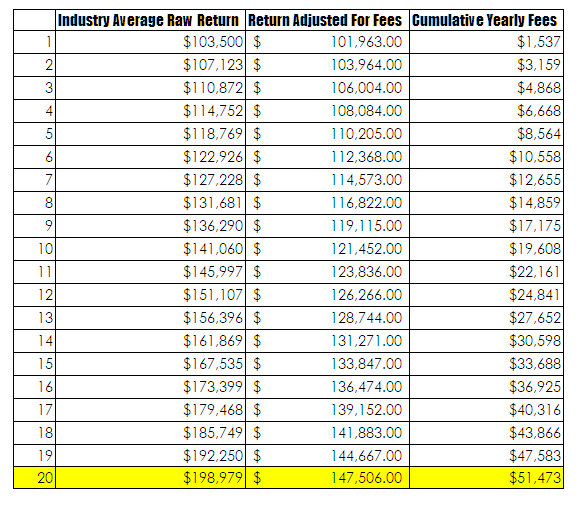
 This table highlights the impact of fees over the life of an account. Once again I have started with a balance of $100,000 and for the sake of simplicity I have not make any additional contributions. Although that doesn’t seem to make much difference. The data to focus on is contained in the last line. If a fund is left to run with the industry average return then the terminal return is $198,979. However, once an annual fee of 1.5% is introduced this return drops to $147,506 – this is a substantial drop. Over the life of the fund the investor will pay $51,472 in fees. Managing a superannuation fund is a head I win tails you lose game. But it gets worse for the average investor since these returns do not factor in the impact of inflation. The average CPI figure over the past 20 years has been 2.49% . In real terms if this had been an actual investment terminating this year the investor would have made no real return, in fact it is highly likely that their true return is negative. Hardly something that an industry should be either being paid for or considering themselves to be masters of the universe over.
There are a few issues here that need unpacking. Foremost is the lack of knowledge that the average investor has, as such they rely upon perceived professionals to assist them. This is clearly a false assumption as the majority of funds are simply rubbish with investors being ripped off continually.The level of fees taken by the local superannuation industry is staggering. A conservative estimate for this year is that the industry will take in excess of $20 billion in fees for delivering no long term value. To put this into perspective imagine if of all the cars manufactured the tiniest handful ran well, some ran like dogs and the majority just didn’t run at all- this is the superannuation industry. The issue of investor ignorance is a harder nut to crack since basic stupidity, poor information flow and profound vested interest prevent investors making sensible decisions. Whilst I cannot give investment advice if I were stuck in the situation of having to have compulsory superannuation I would opt for the lowest fee index linked fund I could find and simply pour money into it.


