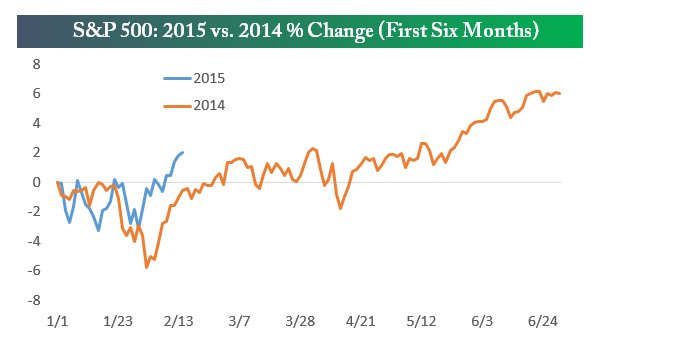
I snipped the graphic below from Bespoke the folks who produce countless and mostly points charts on the market. It compares the percentage change in the S&P500 to date with the first six months of 2014.
The chart above attempts to draw a comparison between the initial portion of this year and the same period last year. The point of which is to enable the trader to both make a judgement not only about this year but also to make some form of implicit prediction about where this year might go based upon the shape of the curve to date. Such a comparison and any drawn inference is pointless since the future trajectory of the market is completely unknowable.
Such charts only add noise and not information to the trading process. The question all traders need to ask is does the information you are receiving or seeking actually add value to the trading process or does it merely clutter your thinking.


Totally agree with this – the future is so easy to predict after it has happened as so many commentators are wont to do.