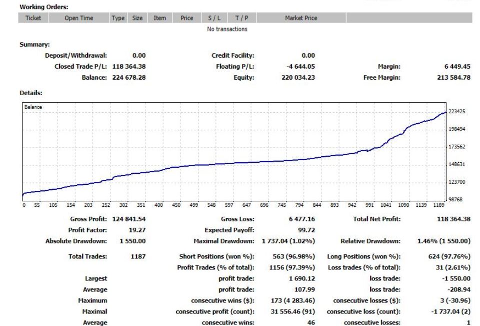
The other day I posted this equity curve that had appeared on social media.
This curve is clearly fake because it resembles the climb profile of a QANTAS 737 leaving Melbourne on its way to Sydney – that and the fact that it claims a 97% win rate. Real equity curves display volatility as wins and losses are accumulated – they reflect the simple fact that wins and losses cluster. Compounding this fact is the market that is being traded and the style of trading that is occurring. If you have an index linked trading system that operates using very long term time frames and employees no leverage then you may expect the equity curve to not display much volatility unless it ran into events such as the GFC. However, even this style of trading would not be a beautifully smooth curve.
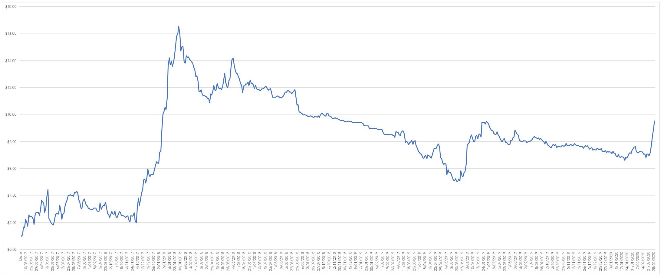
Contrast this style of trading with a system that trades short term positions in what could be perceived to be volatile markets and you would generate an equity curve that looks substantially different to the curve fitted nonsense shown above. Throw in leverage and you will undoubtedly amplify any natural swings in the system. The curve below represents such a system – it is the most volatile system I possess, it trades short term in various markets using a sometimes stupid amount of leverage. It is a system I use for stress testing ideas in a live environment using real money. I do this because you can only learn to swim by actually getting in the water. If an idea works it is transferred to other systems – if it doesn’t it is binned.
Note the overall shape of the curve – it moves and it does so in response to the ratio of wins to losses, how and in what order these wins and losses accumulate and how much leverage the system is being subjected to. It also moves in response to whether I have a new idea to test. Its prime characteristic is noise and all real trading systems are noisy since they reflect the imperfection of ourselves and our systems. As such any real equity curve, you see will reflect this imperfection.


