The act of trading requires traders to perform certain feats of mental gymnastics that at times seem to generate a paradox. You have to have sufficient conviction with a signal to both take a trade and hold a trade against the noise of the market but at the same time have so little conviction that you can kill a position at a moment’s notice. This ruthlessness means that you cannot form attachments to either a given position, sector, or market. Yet intriguingly this is exactly what traders do. I have written recently about the problems of chasing legacy trends – that is looking backward to the glory days of a given move and then having such longing for the return that you ignore evidence to the contrary and take positions in instruments or markets that are mt moving at all. Or worse which are heading in the opposite direction to the one you had planned on.
You may think that in recent years the poster child for this sort of behaviour where attachment trumps rationality has been cryptocurrencies and to some degree, I would agree with that. But crypto lacks the intergenerational staying power of the illogical attachment shown by gold bugs. Boomers have been more illogical for longer than Gen Z who are the main evangelists of cyrpto. Gold bugs cling resiliently to the notion that gold outperforms every other asset over every time frame and they do so irrespective of the evidence to the contrary.
Traditionally when gold bugs you see an image such as the one below from Investing.com
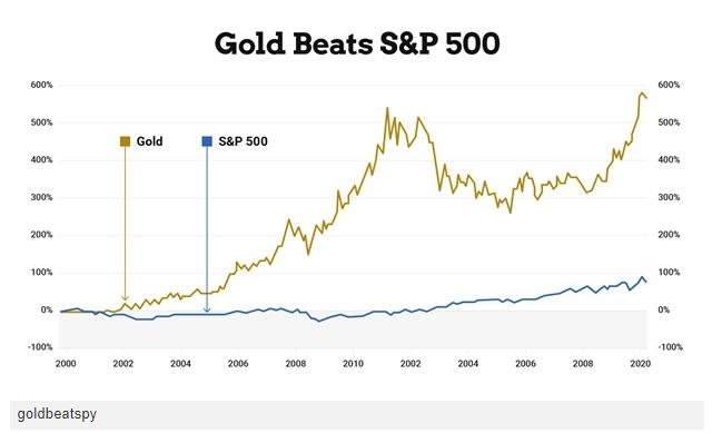
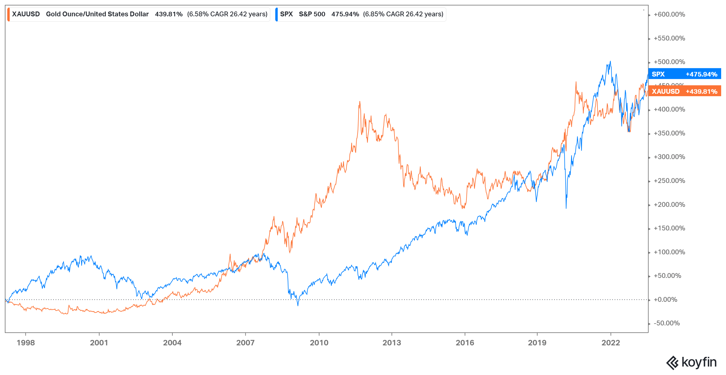
The year 2000 is always selected as a starting point for these sorts of comparisons because it is the year Gold recovered from its multidecade bear market which saw it lose 61% of its value over a 22-year period. If I move the start date back three years to 1997 a different picture starts to emerge. This points to the power of choosing your starting date.
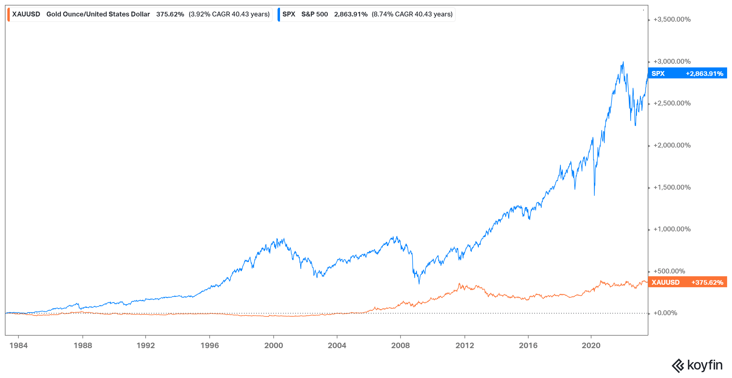
 Moving the date even further back to take in gold’s bear market changes the tone of the picture even more dramatically.
However, as I have said before using percentage change when comparing instruments is somewhat lacking – a superior measure is to look at the value of $ 1 invested in an instrument. This gives a much more realistic sense of what returns look like over time. The chart below looks at the comparative $1 return from gold versus the S&P500.
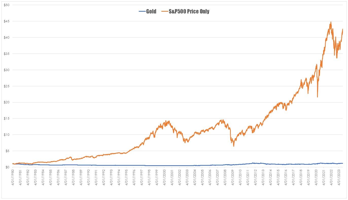 This chart shows that if you had bought $1 worth of gold and held it to today it would be worth $1.17 the same investment in the S&P500 would be worth $42.59. Repeating the exercise but substituting the S&P500 Total Return index would be worth $129. All of a sudden your favourite pet rock doesn’t look that attractive as an investment over the long term.
This does raise the question of what happens when we look at the value of $1 invested using the favourite start date of the gold bugs and we see s a slightly more nuanced picture.
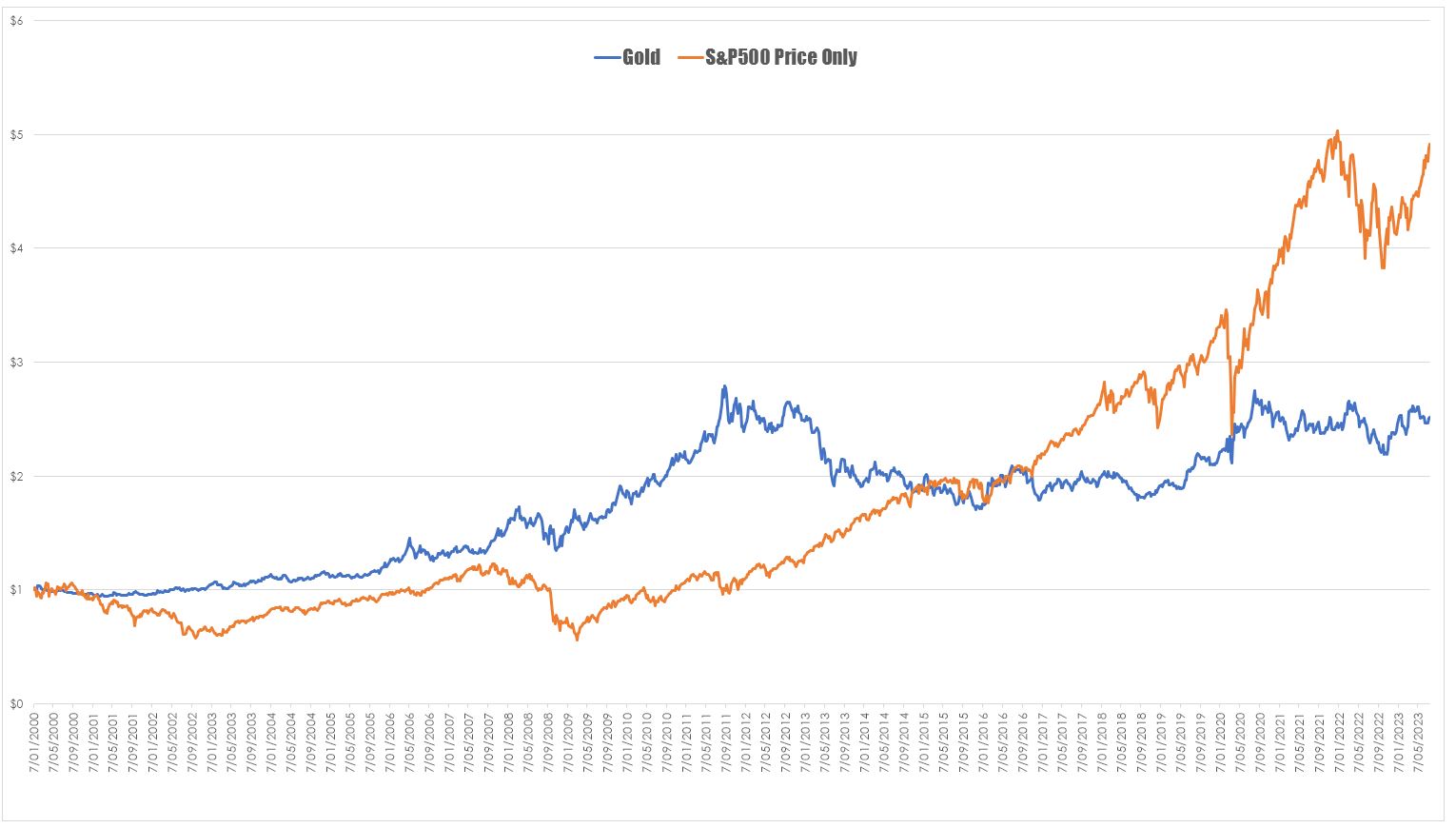
Even with the impact of the tech wreck and the profoundly debilitating impact of the GFC – the S&P500 still comes out ahead. The expectation would be that with the massive financial shocks over the opening two decades of the 21st century gold would be well ahead. But it which may speak more to the changing view of the metal as a hedge against uncertainty.


Brilliant as always What a great mind
Thanks Chris – very informative – just shows you always have to look at the big picture 🙂