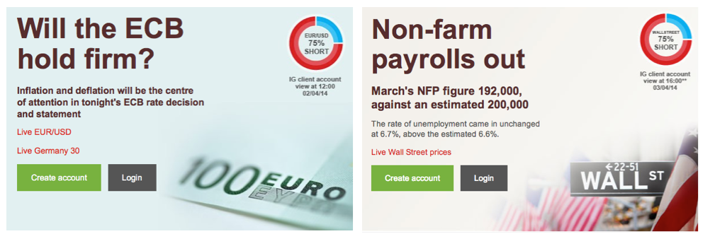
When I opened IG’s dealing system the other day I noticed these widgets on the home page. They seem to change each day or so whenever there is some new impending announcement. i understand their function from a marketing point of view but was actually wondering whether anyone paid attention to them. The problem as I see it is they dont give an indication over the time frame in which the sample was taken. So it doesn’t compensate for differing trading views. for example being long on a weekly system has a very different connotation to be long on a 5 minute chart. I am assuming that IG sum the net longs at a point in time and generate the widget.
 Any guesses?


Decoration?
I think they are the state of positions in the IG database at the time the widget was extracted.. so for wall st 75% of positions were short as of 4pm 3/4/14..
so if you are thinking of going long .djia then 75% of their customers think you are wrong..
I find it reassuring to often see I am one of less than 10 customers even interested in an instrument – this comes up in the Insight button. But it is also good to feel in the majority when you see you are joining between 50 and 100 – all of whom are long..
I know what they are – I want to know how they are constructed since being long over a 1 minute time frame is different from being long over a weekly time frame.
Sorry Chris don’t know how the numbers are constructed…and that’s reason enough to ignore the pretty chart.