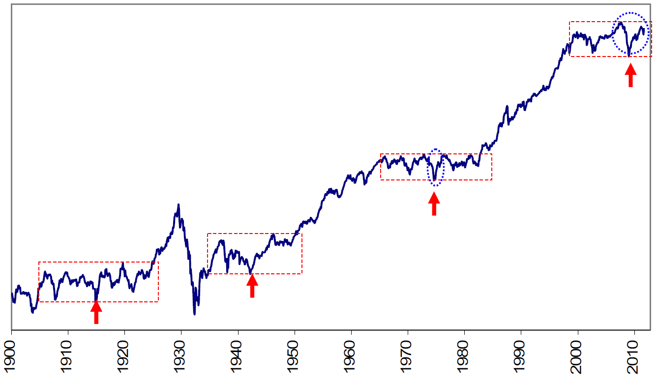
The chart below is from Merrill Lynch’s Market Analysis and it shows according to their definition the last four major bear markets including the bastard of a one we are stuck in at present.
From my perspective the issue is the relevance of such charts – granted there are lost decades for buy and hold investors. Unfortunately, for retirees with money invested in managed super we may be in one of these periods of minimal growth as managed funds struggle to cope with a market that is doing something other than going up.
However, it could be argued that managed funds have been in a near market for the past 10 years. The Australian Prudential Regulation Authority surveyed Australia’s largest 200 superannuation funds and found that the average return for the past 10 years has been 3.9% pa. In fact some $200 billion is locked in funds that have returned less than this somewhat ordinary benchmark. To put this in perspective the average return on a CMT for the same period was around 5% and the return for the All Ords Accumulation Index was about 7%. So fund managers in Australia act as a drag on performance – the funds would have done better without them.
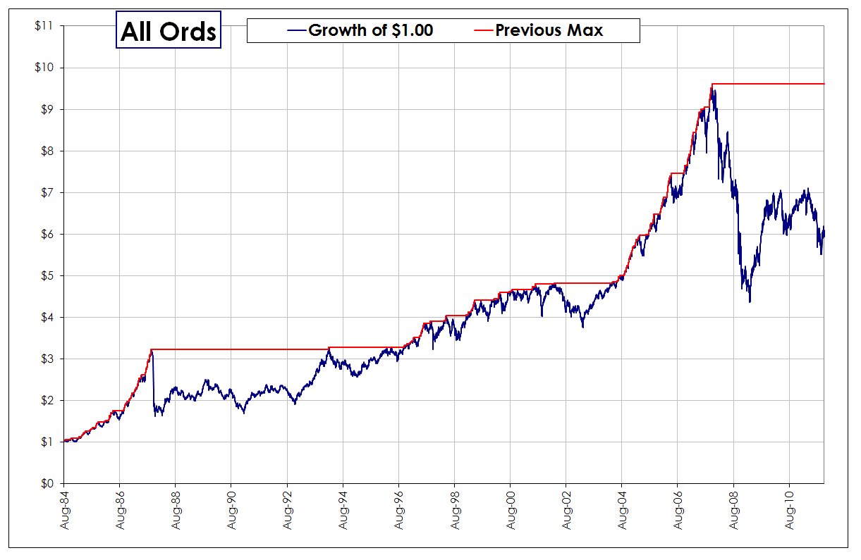
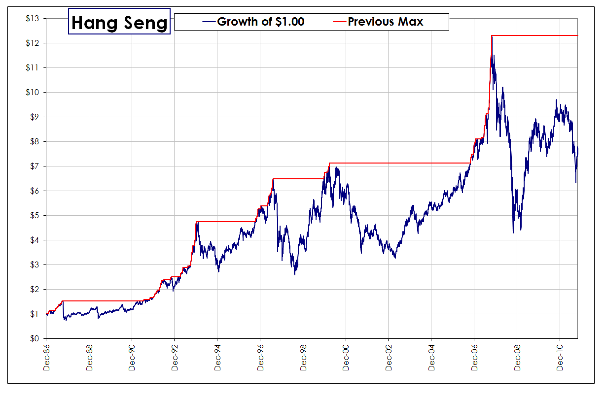
Whilst charts such as the one above are interesting they only show part of the story. Below I have dropped in two charts that show the value of a a dollar invested in both the All Ords and the Hang Seng.

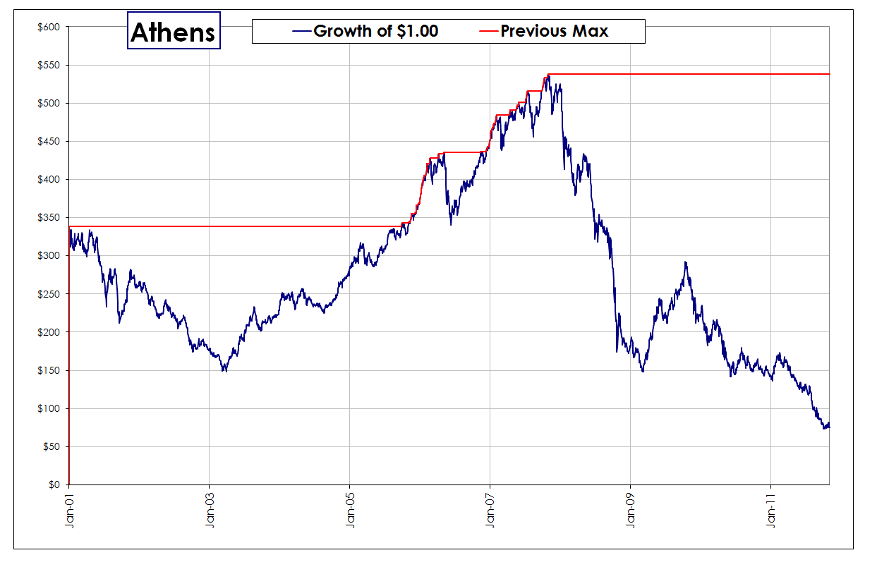
 You will notice that actually putting a dollar value on an investment makes it much more compelling in terms of the impact that lost time has. However, this is till only part of the story – these charts only apply to those who simply sit in positions and unfortunately that includes the majority of (probably all) fund managers in the world. But each chart has opportunities because each chart has movement – problems for traders only really occur when there is no movement or that the movements oscillate around a point.
Whilst this environment is a pain for longer term trend followers there are also ways other markets. And things could be substantially worse.


