What Is The Central Issue?
Whenever markets have any sort of hiccup (read dont go up in a linear fashion) all sorts of commentary comes out of the woodwork. I therefore thought it would be instructive to look at the events of last week and to put them into some form of context beginning with a short term view.
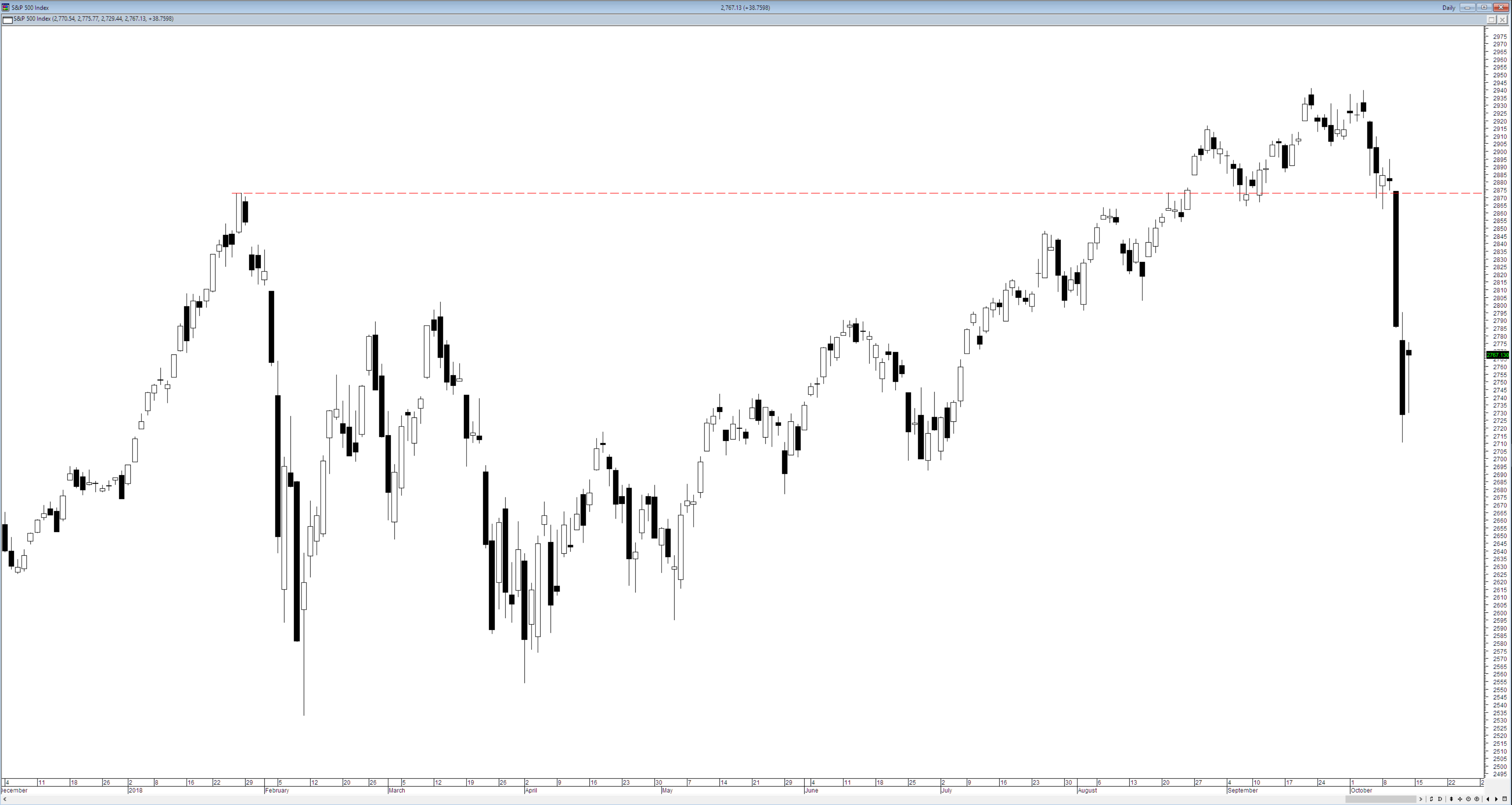
The S&P500 began the year with a bit of a slip followed by a slow modest uptrend before attempting to take out the previous all time high. Following last weeks fall the market is up about 3.5% year to date. When viewed over a short term time frame the S&P500 looks quite bumpy with two significant trips this year but taking a step back shows a slightly different picture.
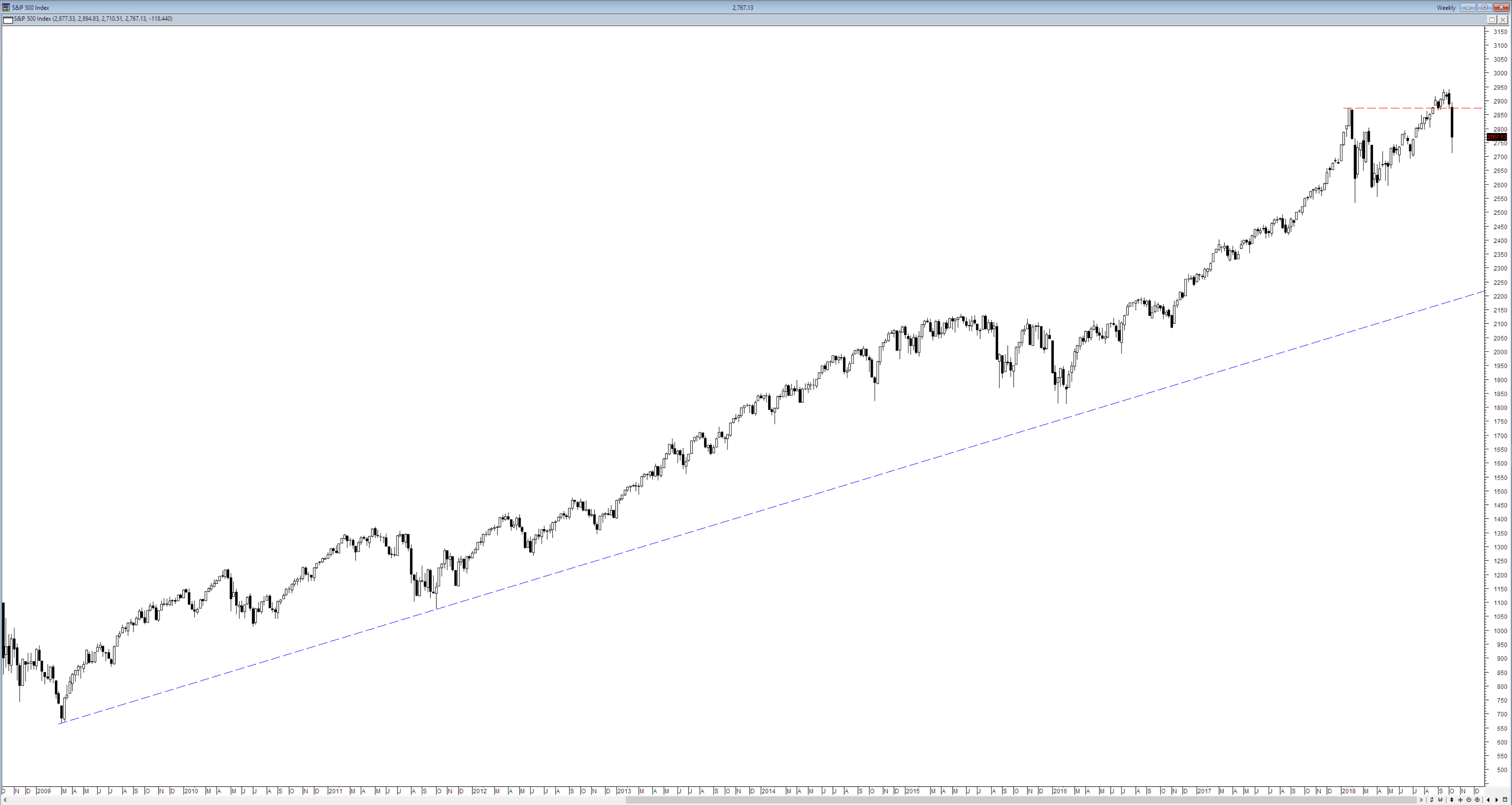
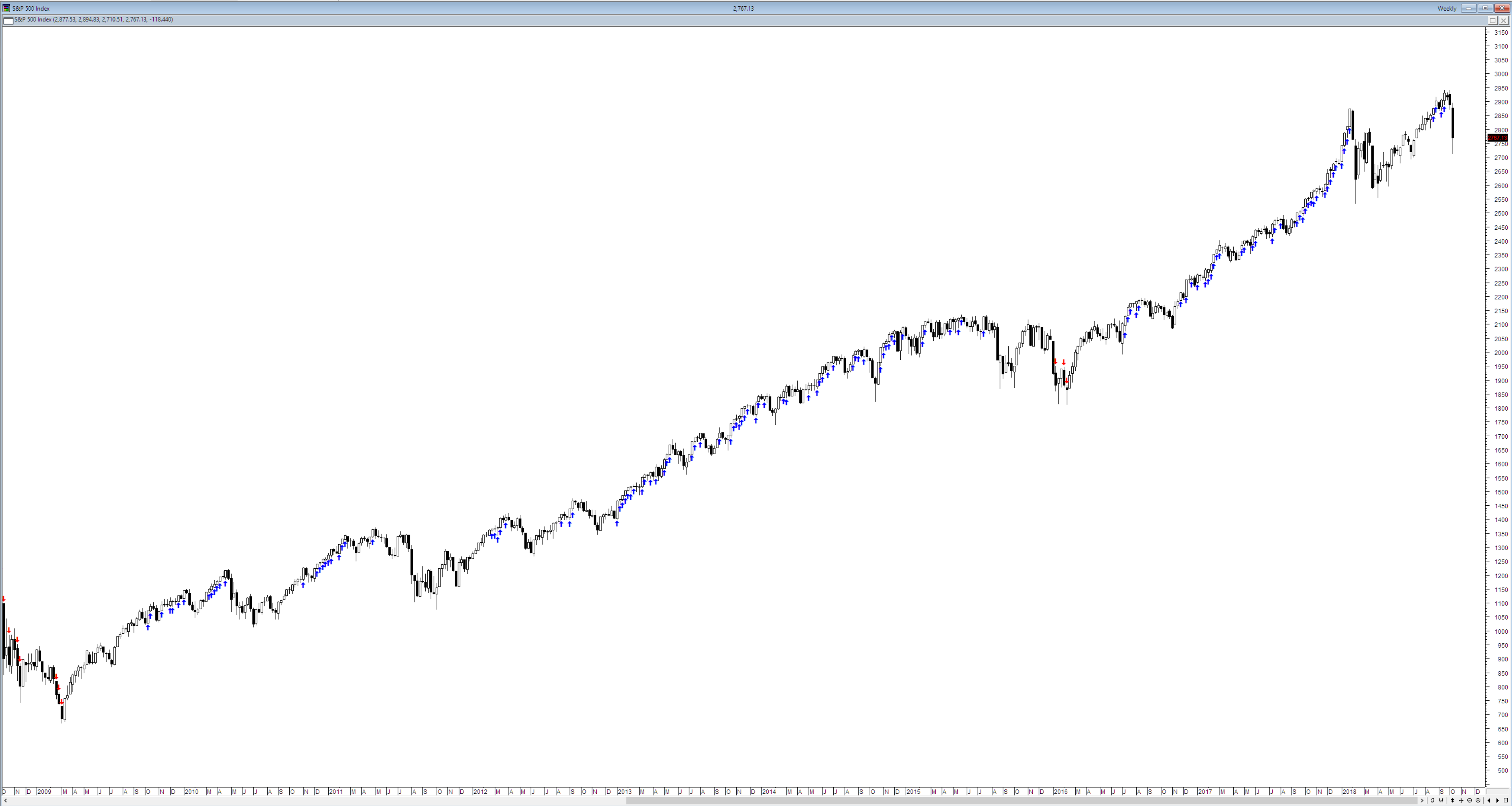
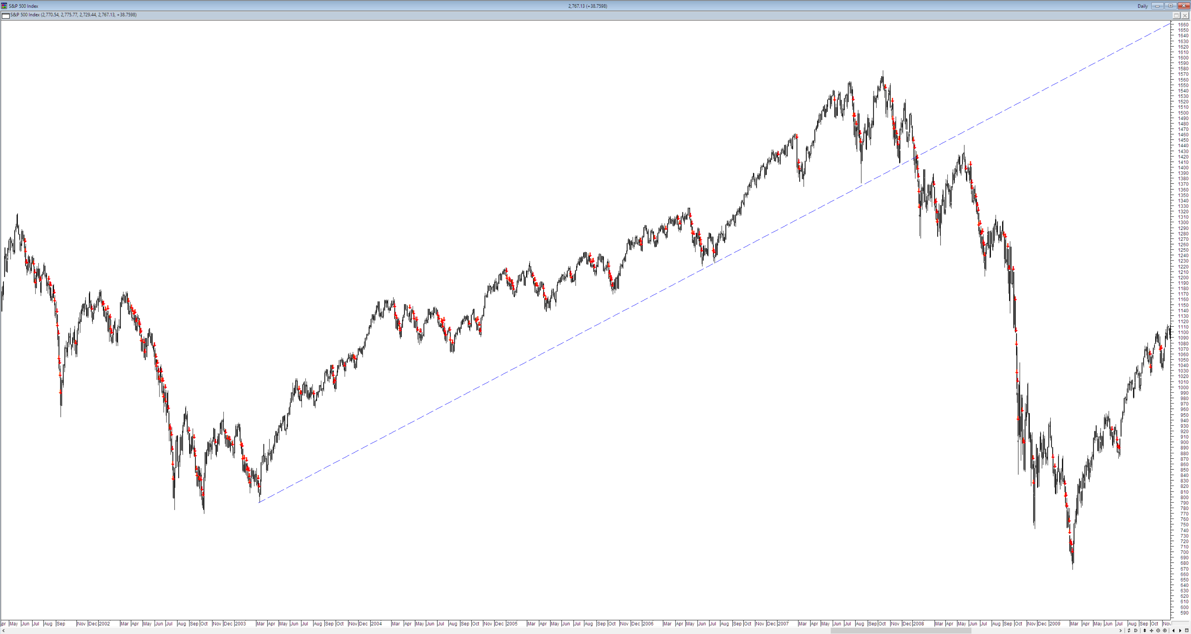
If we start at the the low following the GFC and draw the broadest possible trend line we can we see that the noise disappears and the market is in a wide long term uptrend and at points in the past it faltered whilst trying to make new highs. This is not in any way predictive it is merely descriptive of the the past and what I would consider normal market behaviour. As I have been repeating endlessly for the past three decades markets go up and markets go down – why people are surprised at this is beyond me. To get a sense of the energetic nature of this market I then plotted 52 week highs and lows.
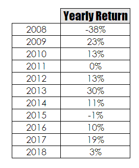
As can be seen the market made new 52 week lows during the GFC and then did not make another one until 2016 and last weeks fall has not come close to triggering another one. The move in US markets since the GFC has been extremely energetic and this can be seen by looking at the yearly returns since the end of the GFC.
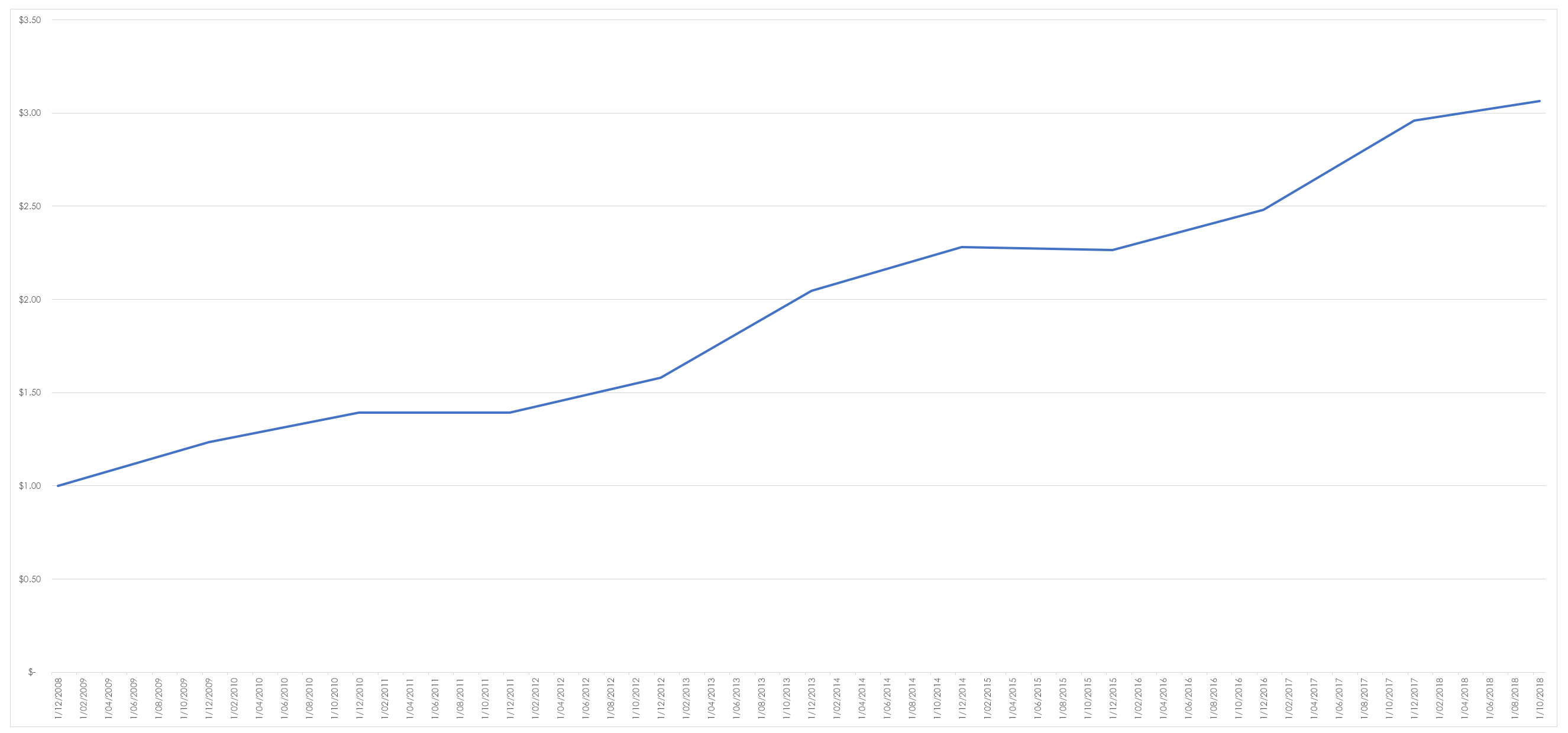
The average return for the S&P500 since 1950 sits at about 9%. If you had fluked investing in an index fund at the end of the GFC your equity curve would look like this –
You would have had a reasonably smooth ride whilst tripling your money.
When looking at markets context is everything as all events occur against a backdrop of history and the historical reference point everyone uses and which comes into the consciousness during events such as last week is the GFC. The wounds to investor psyche from the GFC run deep. However, as with all things all we can do is look at the data and remove ourselves and our flawed perceptions from the decision making process. To illustrate this I have dropped back into a short time frame. The chart below shows 15 day lows only.
As you can see there are actually very few. The reason for this is simple – the market is in a long term uptrend. Contrast this with the number that occurred as the GFC was unfolding.
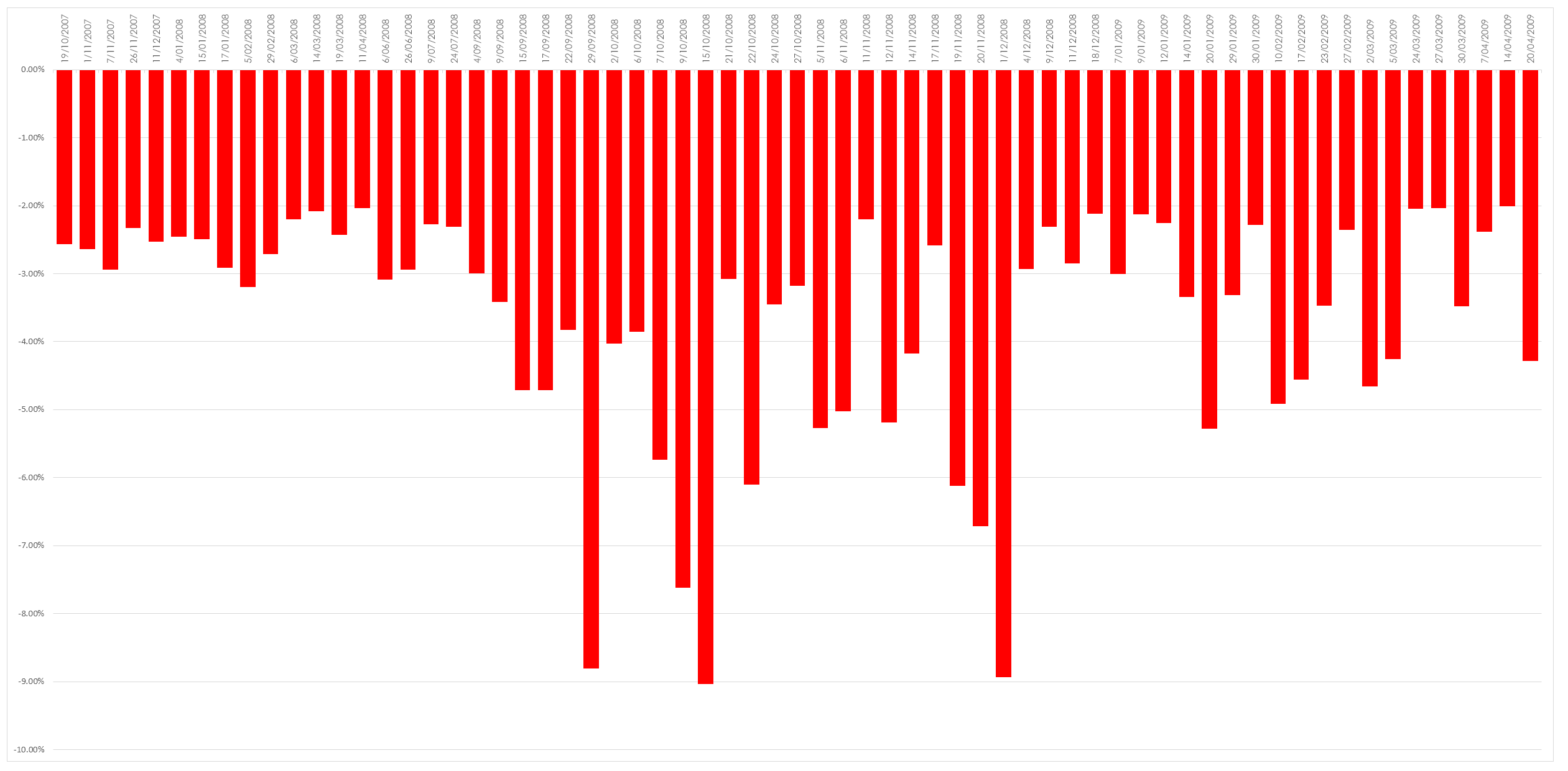
The rational for this disparity is simple, as the GFC broke the US market had broken its long term uptrend. What is also interesting to note is that on comparative terms the US market during this period had been a relatively poor performer. This clustering of falls becomes more apparent when we map them in isolation. The chart below looks at those falls which were in excess of 2% during the period of the GFC, as can be seen it was not a happy time to be a long sided stock trader.
The key point in all of this is that the only thing that matters is the context within which events unfold and this context can only be understood by taking a step back and removing yourself from the noise. In simple trading terms markets experience pullbacks – they do not climb in a linear fashion and these pullbacks take on different levels of importance depending upon whether the market is trending up or down.





Fantastic explanation and just what my trading psychology needed to hear today.
Thanks Chris
Great opp to go long again……