I have been spending some more time playing with the data set below which I looked at last week within the context of long term returns for the All Ordinaries.
One of the issues that is difficult for traders to come to grips with is the lumpiness of returns that are generated by trading systems. I dont know of any trading system that generates regular returns aside from much touted option writing systems and these generally lead to traders suffering from the old maxim of eating like birds and shitting like elephants. Using the returns above I decided to look at the difference between a system that had the above returns and one which every year simply generated the average market return of 9.8%. The results for such a system can be seen in the table below.
As you can see it takes a good two decades before any serious differential appears but once it does appear it becomes extreme.
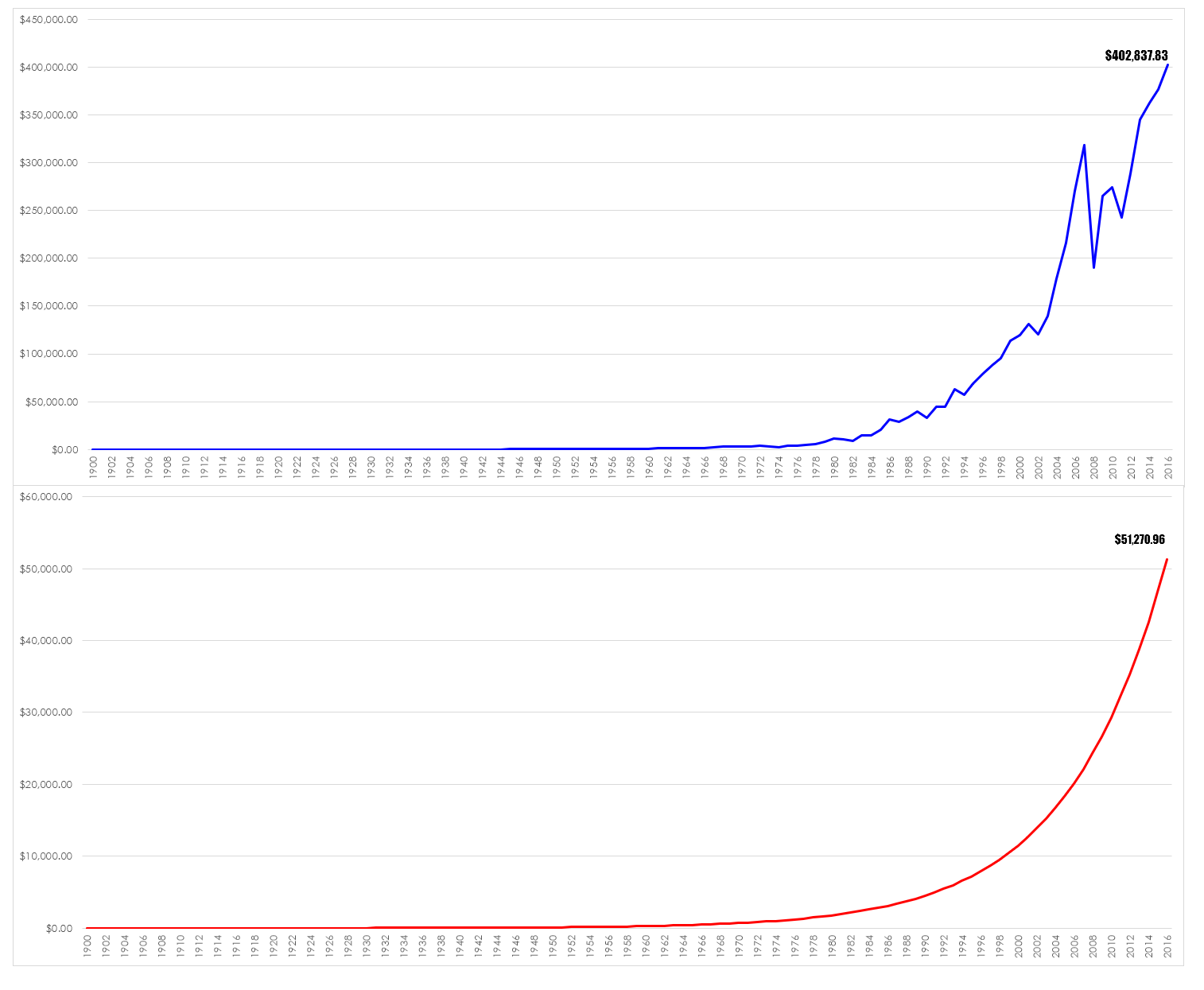
However, table doesn’t quite convey the magnitude of the difference between accepting a given flt return each year and the returns generated by the lumpiness of the market so I decided to graph the returns. I have had to graph them separately because of the disparity in values between the two systems.
In simple terms these graphs ask the question – do you want to be rich or comfortable?


Ahh to be young again, and to have this gained knowledge, and to have the guts to follow the wisdom of that knowledge.
Alas I am much older. So the true trodden path of being overly cautious will be used to see me comfortable. At least I am doing it on my terms, and not the dictates of an overseer.
Unfortunately Rome and Caesar still have there hands.
Thanks Chris. It is good to come back to earth occasionally.