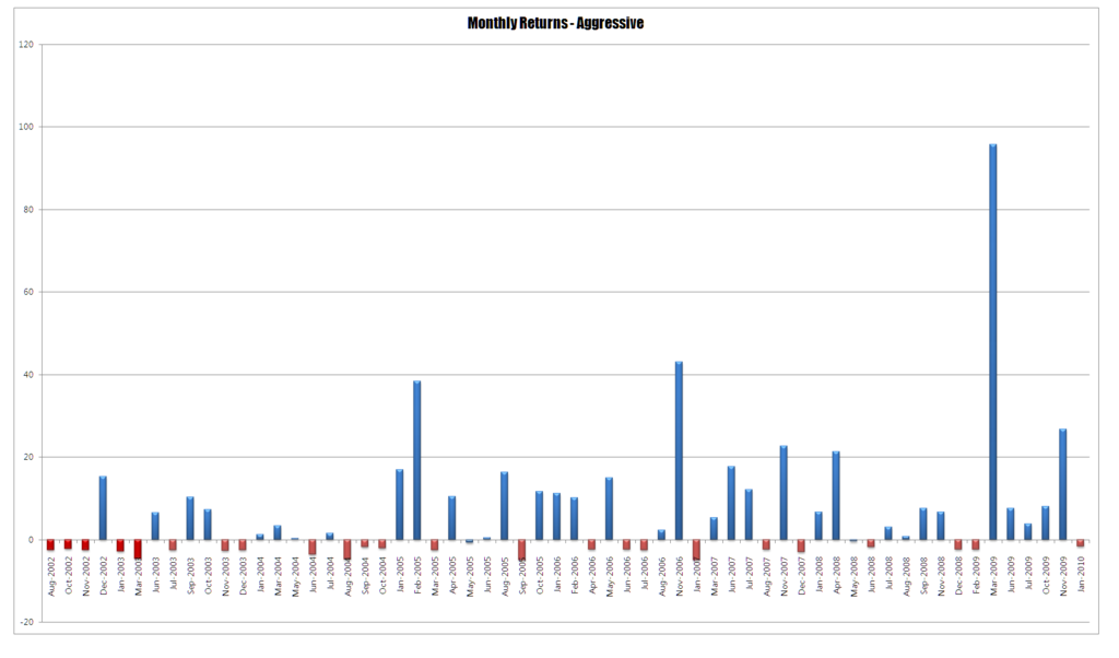
As part of a recent discussion in the Mentor Program we looked at the nature of returns and how they can be distributed in the real world which is very different to how you want them to be distributed in your head. For the conversation I posted the graph below which is a series of monthly returns for one of our systems.
Discussion around these sort of returns are always interesting because they betray some interesting aspects of our native biases. When I post this sort of thing everyone’s eyes are automatically drawn the the three large outliers and the data points in between are missed. All that is seen are the highlights and not the trajectory. There is a pronounced tendency to anchor on these results and only these results, so we lock onto these not as outliers but as inevitable and more common than they actually are. More important we assume that these are the defining elements of the system whilst ignoring other data points. Optimism is a natural thing in people and traders need to be optimistic to keep going but we tend to run head long into the land of optimism bias where we overestimate favourable outcomes. There are a few things about these results that need pointing out. Firstly, the system starts of with a cluster losses and losses are a predominate feature of the system. Secondly, and from my perspective most importantly is the time scale – this was missed by everyone. The outliers come several years into the systems history. Both system and operator have to mature and this process takes time.
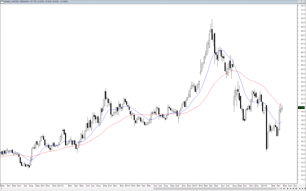
This focus bias that occurs when we look at results or charts of any sort is important in developing systems and ideas. Consider the chart below which has two moving averages on it.
The eye is naturally drawn to the to the final third of the screen where we have a sharp lift and then collapse. We see that for this instance the moving averages did a good job of capturing the move. Our brain then makes a leap and assumes that these moving averages will capture every move and in isolation if every move where like this then they would. However, price does not move in a sine wave, it is dirty, lumpy and chaotic. Conditions that do not suit moving averages very well./ If you look at the above chart again you instances where the crossovers went nowhere or simply cycled through congestion. The central issue is that we did not evolve to trade – we evolved to survive by seeing patterns and perceptions of movement. It is natural that our psychology is geared to maximise this sort of behaviour but in trading it can lead us to make false conclusions or to see things that are not really there. Or which perhaps require much closer and thoughtful inspection.


Thanks Chris, that first chart you showed was very interesting. So interesting in fact that I wasted no time plotting my own. A very sobering picture, and I thought I wasn’t doing too bad. The 17 months during which I have been trading match the chart you plotted fairly well, if not slightly worse.
It is interesting to note that the losses are capped to a very low level in comparison to the gains over time that would indicate that the system employed is efficient in producing the desired results.