With the market making a valiant effort to push past 6,000 points I have been pondering where the gains in the market have come from over the past few years. In the past I have looked at the distribution of returns across groups of shares simply from the perspective of demonstrating that within a universe of instruments the majority of returns come from a few entities. Naturally the same is true for trading systems – a few trades each year provide the bulk of the returns. This feature of trading is one of the hardest for new traders to adapt to since they assume that trading is like other jobs where you are rewarded at the same rate for the same amount of effort.
I thought about broadening my horizon to look at the balance of returns that occurs between price movement and dividends across a given market since this data is reasonably easy to obtain and therefore manipulate. I took a look at the difference between the All Ordinaries index and the All Ordinaries TR index. As a simple raw observation the All Ordinaries hit its nadir post the GFC on 13/03/09 when its low hit 3090.80, its last full weekly close was on 21/04/17 when it closed at 5885.60 – this is gain of 90.42%. The All Ordinaries TR had a low of 20,858.64 on 6/3/09, since then it has climbed to 55,605.18 – a gain of 166.58%. There is a substantial difference between the long term rate of return of the two indices. Unfortunately, this differential is often seized upon and used by the buy and hold brigade to offer the mantra of simply investing for dividends but I don’t think that is what the data is showing. What the data shows is the naturally higher rate of compounded return from simply folding back dividends into the equation. It doesn’t offer sufficient evidence to support the line of investing simply for the sake of dividends. If it does offer anything it gives a glimpse into the usefulness of a sensible index ETF strategy.
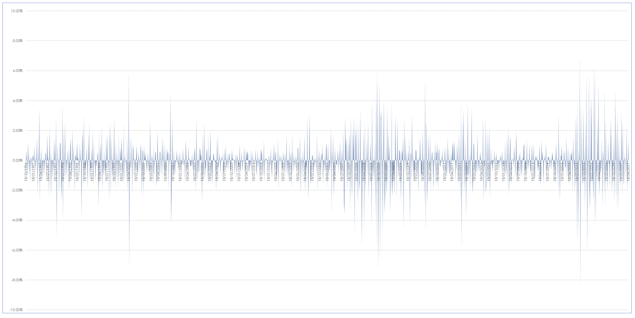
I wanted to take a deeper look at the differential between the weekly returns from the two indices to see if it told me anything deeper about the relationship between the two and the actual stage of the market. The graph below demonstrates the differential between the two dating back to 1996.
As you can see the data is fairly noisy but there are one two points that you can generate from it. There is a distinct scalloping in the data in the early part of the century, my interpretation of this is that this is a natural function of a market running hard. In fast moving markets the majority of index gains come from the generation of dividends. As you move beyond the GFC you can see an expansion in the differential – dividends as a source of internal return have become more important. This is to be expected in lacklustre markets. My feeling is that the downward pulses that you see post the GFC are in part due to price attempting to recover but also are a function of the cyclical nature of dividends.
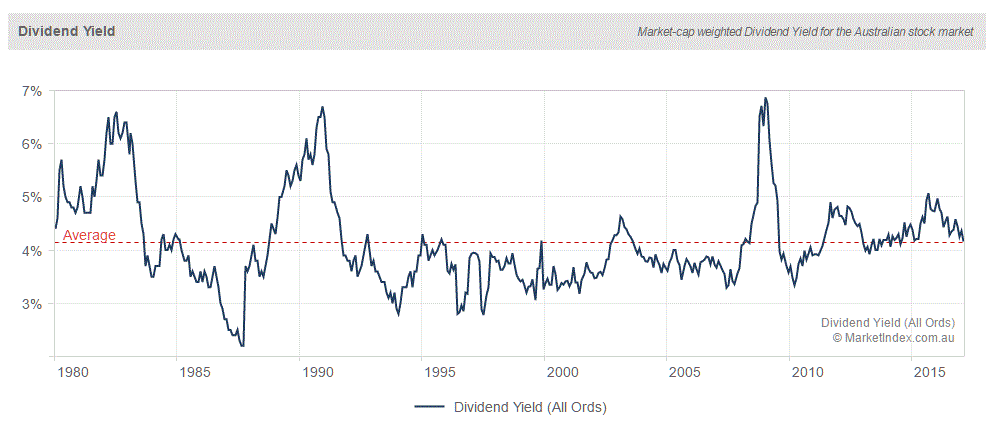
Whilst interesting I am not certain it tells us anything we didn’t already know. However, when I was preparing this I did have a recollection of an analysis I used to do by hand before the age of boundless and often needless information began to distract me. In the past I used to had chart the All Ordinaries dividend ratio and use it as a measure of market energy and I though ti should be easy enough to see if some clever clogs had done the work for me. And courtesy of two seconds on Google I found someone had. The chart below is from Market Index a group that provide and absolute plethora of markets statistics.
As you can see it presents a similar but much clearer picture of the ebbs and flows of the actual dividend yield of the All Ordinaries. As can be seen when price is running strongly the relative impact of dividends decreases – that is the overall yield drops. When markets are doing poorly the average dividend climbs as price collapses. I will leave it to each individual to see if this sort of information adds anything to the veracity of their macro trading decisions.


