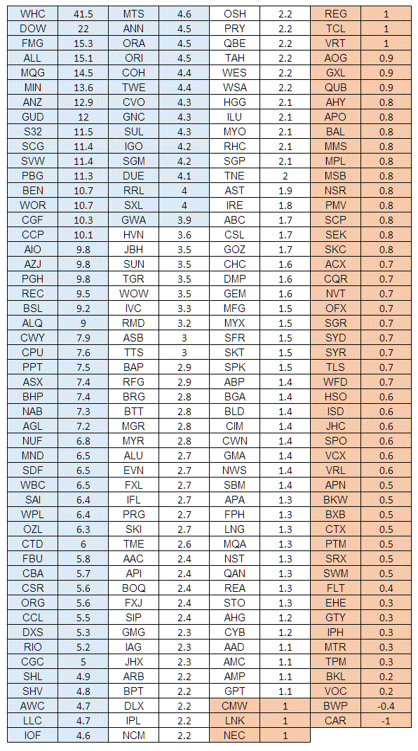
I have been thinking some more about the issue of short selling and the problem faced with the upward bias of equities. Armed with excel I decided to look at the average gain as a function of the average loss for the stocks in the S&P/ASX 200 – once I had the data it was a simple matter of dividing average gain by average loss for the past year and seeing what the data said.
I have colour coded the data in the following way – those coded blue are above average, those coded orange are below 1. The higher the number the better the performance of the stock in terms of its average gains versus its average losses over the past year – this doesn’t necessarily mean that the stock was a runaway winner in terms of trend trading but rather it had a strong propensity to make good its losses. It should also be noted that all this does is tell us a little bit about the past and nothing at all about the future. Ideally, if you were a stock picker you would want to look back and see a high number and a strong propensity to trend over the long term – the winner for this period of data is WHC. In terms of losing stocks a ratio of 1 could be interpreted as the stock simply meandered during the year and congested and a ratio of below 1 is a bad sign.
What is interesting to me is the strength of the upward drift in stocks. However, it does need to be considered that the S&P/ASX 200 is a biased sample size since stocks are in effect selected for their upward drift. My guess is that if I were to repeat this list next year some 20% of these stocks would baring some miracle have been dropped from the index and replaced.


Hi Chris – How do you define an average loss/gain? Based on a daily price move? Past year: 2016 or running year, say 10Apr2016-7Apr2017 (this shouldn’t matter much though)?
Thanks, sergy
Its a running year from when I did the initial work last week and its based upon daily data.