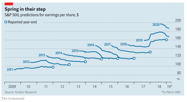
The chart below flashed across my screen this morning, ostensibly it is related to a story on the potential seasonal nature of earnings. What the authors haven’t realised is that it highlights a completely different point – analysts dont have a clue what they are doing yet financial journalists write stories around the rubbish data they put out.
Source – Economist
If you look closely at this chart you see a series of predictions for the EPS of the S&P500 – this is measure of the financial health of the index. However, note the variations between the predictions for year end EPS and the actual reported figure. The predictions are wrong every year. This raises the question of why bother?


