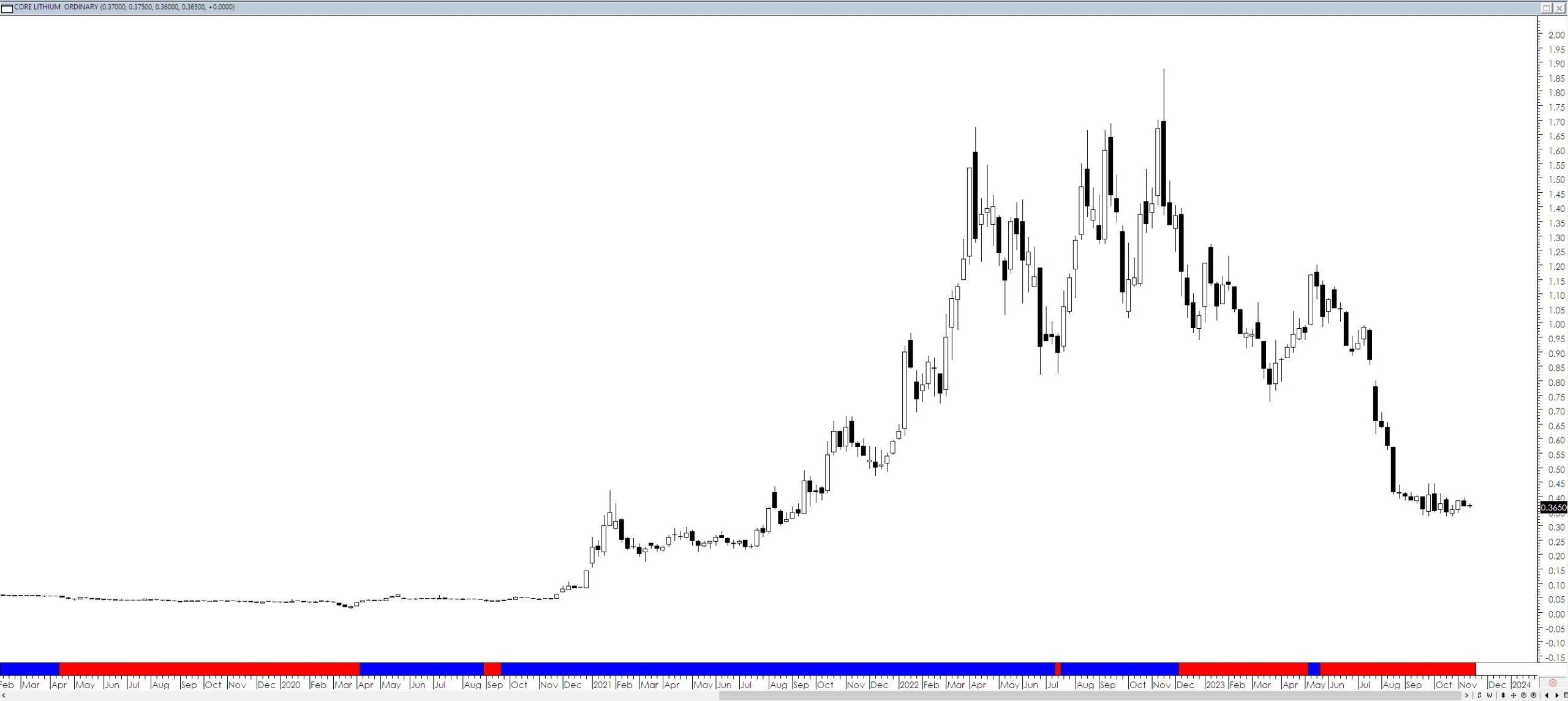
Whenever we are presented with a piece of data we are limited in the conclusions that we can draw from that data. For example, consider the chart below of CXO –
The only conclusion I can make is that over the time frame being observed and the tools being used the price is currently in a downtrend. I can make no other observations at all – I can offer commentary on the past and what happened during the lithium boom but anything else is speculation and is not supported by the available data. It is me merely either guessing or trying to rationalise decisions I have already made.
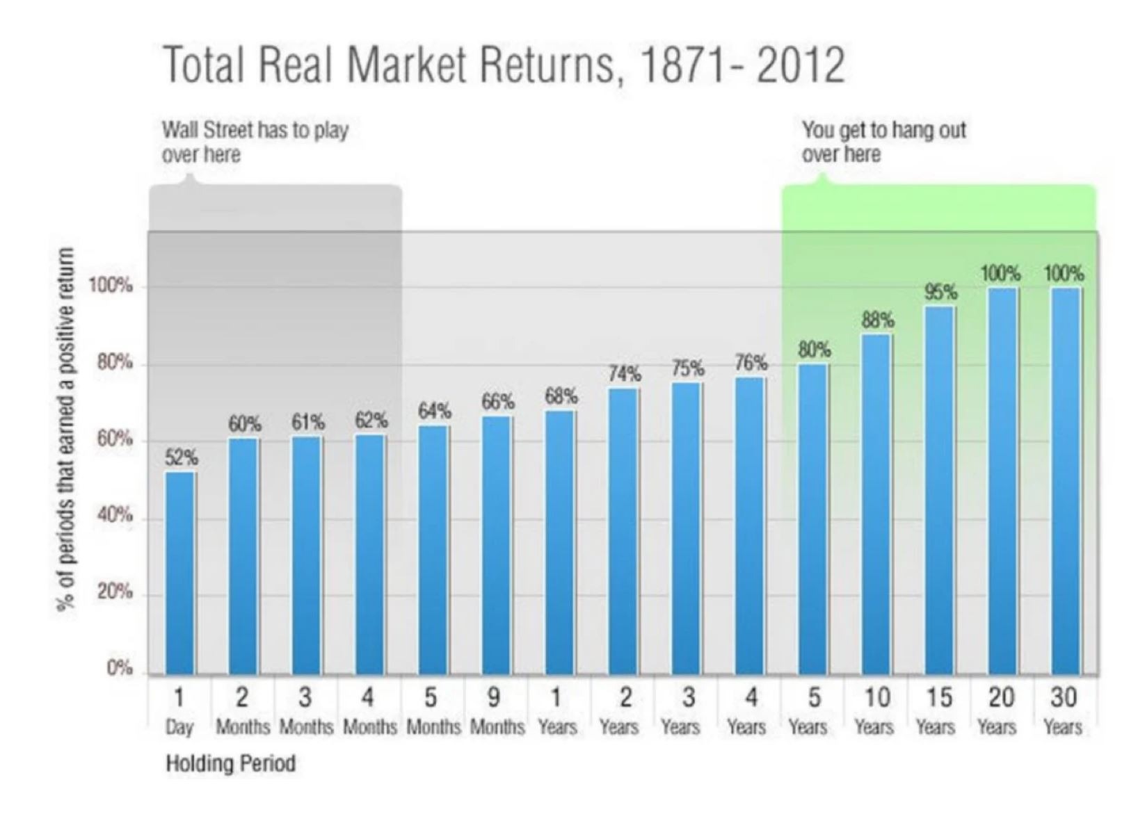
At present there is a chart doing the rounds that everyone who I have seen comment on it has gotten it wrong. The chart in question is shown below. It shows the probability of a loss as a function of holding times.
 The interpretation of this chart is that all you have to do is buy, hold, and repeat over decades and you will make money. This conclusion is not in any way supported by the chart. What the chart actually shows is what happens if you buy the index, not individual shares. Yet the interpretation being presented is about individual shares, not an index.
This may seem to be a pedantic point but in trading small points matter as they are often the dividing line between doing well and blowing up your account. In addition to this, there will be endless individuals spruiking this message to people as some magic panacea for actually doing their homework and taking an active approach to the management of their portfolios.


